Accessibility myths

Let’s face it: accessibility is still kind of a niche topic. And, as with nearly every niche topic, there are some “common knowledge” things or, as I like to call them, myths. I’ve chosen some of them and in today’s article, I will dig into them to see if there is some truth behind them.
Myth #1: “Accessibility is just for people with disabilities”
This myth is wrong on two levels.
First of all, the “just” part. According to official WHO statistics, there are over 1 billion people with disabilities around the world (to put it in some context: there are about 4.9 billion users of the Internet). According to some other official UN statistics, 13.4% of Poland’s population had some sort of disability. And these stats are probably lower than the real numbers because they’re mostly focused on permanent disabilities and there are some differences in the legal definitions of disabilities between countries. If you miss on “just” people with disabilities then you miss a lot.
But accessibility is not only for people with disabilities. It’s about building products for the widest possible group of users. Especially since everyone can experience some sort of disability. When someone thinks of a disability, they probably think about a permanent one. But there are two other types of disabilities: temporary ones and situational ones. Microsoft sums it up pretty well in their Inclusive Design Toolkit and I would use the example proposed there:
In the case of motor impairments, the permanent disability would be a missing limb, e.g. arm, the temporary one would be a broken arm, and the situational one – a mother carrying a child in their hand, which limits their ability to use that hand.
Such classification means that basically every one of us can experience some sort of disability in our lives. And in fact, even the World Health Organization (WHO) notices that!
Almost everyone is likely to experience some form of disability – temporary or permanent – at some point in life.
Even if you’re totally healthy today, it does not mean you will be totally healthy tomorrow. Heck, you could slip on a banana peel any time and fall down the stairs! And that’s where the idea of selfish accessibility appears: don’t design for people with disabilities, design for your future self! Imagine yourself in 10-20 years. I bet that your (and mine, too) sight won’t be so good anymore. Why don’t then increase that default font size a little bit? It would do good for your retired self but also help others now!
Myth #2: “Accessibility is generally about screen readers”
Accessibility is also about screen readers but they’re just one of many assistive technologies that are aiding people with disabilities in their everyday activities.
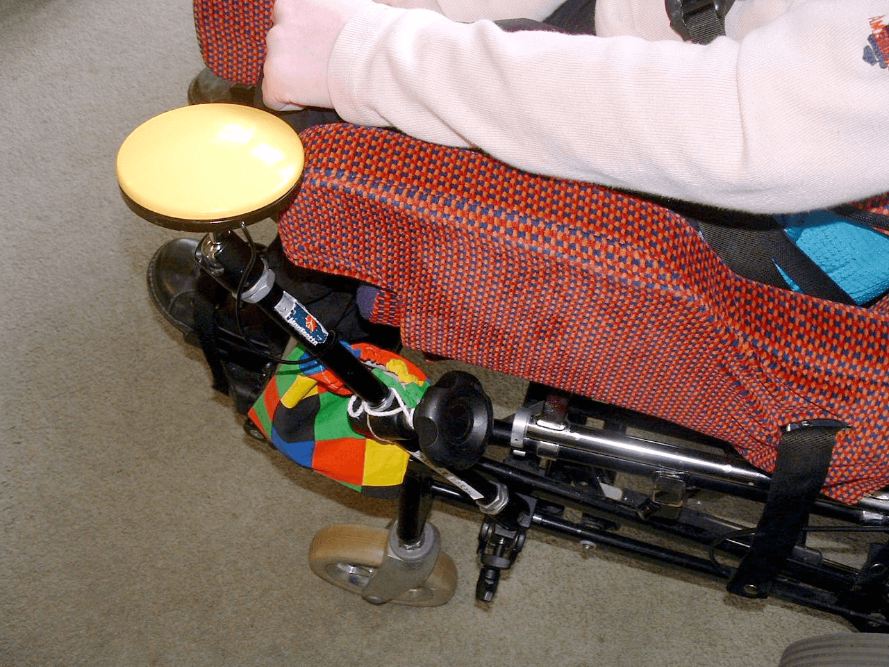
A refreshable braille display can be an example of assistive technology. Instead of reading the contents of the screen out loud, it transforms it into Braille characters by raising pins from its surface. There are also assistive technologies designed to aid with motor impairments, e.g. access switches. They come in many shapes, e.g. a single button that can be pressed by hand or leg and is used to steer a focus on the screen: the focus indicator slowly moves through all elements on the screen and the user can press the switch when the focus is over the element they want to interact with.
Other examples of assistive technologies include software for voice control (e.g. Dragon NaturallySpeaking), software for stabilizing the view displayed on the screen (e.g. Staybl), or even some custom solutions for particular cases (e.g. brain-based communication with a person in a completely locked-in state).


Myth #3: “Accessibility is the compliance with WCAG”
WCAG is a standard that describes how accessibility can be implemented. It contains tons of techniques that are connected with particular guidelines devoted to different accessibility issues. I wrote more about WCAG in my article about accessible buttons.
But WCAG in many places is, well, too lenient, and it covers techniques that are not necessarily the best ones for delivering user-friendly and, at the same time, accessible solutions. Still, they’re enough to make a site compliant with the standard, e.g. by providing buttons to increase/decrease font size. It’s worse than zoom built-in in every modern browser but if you want to be compliant with the standard, nothing stops you from using it!
Actually, font size is a really funny example. The WCAG standard lacks any guidelines that would require a certain minimum font size for all text on the page. There is only one guideline that requires the ability to increase the font size up to 200%. So technically the page with 1px font that allows the user to change it to 2px is compliant with the standard (at least with that particular guideline; it could violate other guidelines). But is it accessible? I doubt it.
Myth #4: “Automated checkers catch most of the issues”
That would be awesome if Lighthouse could catch all these pesky accessibility bugs! You would just run it, fix the found issues – and it’s done, the accessible product is ready.
But, unfortunately, that’s not the case. According to UK government findings, automated tools catch about 40% of all issues. That’s less than half of them!
It’s partly caused by the fact that some issues can only be discovered by a human. Automated tools are great in revealing problems with insufficient contrast ratio or lack of the [alt] attribute for images. But they fail shortly when there is a need to verify if such alternative text for an image is relevant in the surrounding context. That would require some really sophisticated artificial intelligence (AI)! And guess what – humans are still the most sophisticated AI in the world (although not necessarily that artificial). And because automated checkers aren’t that smart after all, it’s quite easy to cheat them.
But there is also a much more subtle thing: these checkers do not check accessibility. Instead, they verify compliance with the WCAG standard. Granted, compliant sites and applications are more likely to be really accessible but, as I pointed out already, it’s not always true.
Myth #5: “Just run a screen reader and testing is done”
That would be true if screen readers were the only assistive technology in existence. But they aren’t and such testing could be actually pretty exclusive. Because testing only with a screen reader would ignore many groups of people, including:
- people that use a keyboard for navigation but don’t use a screen reader
- people that navigate with speech
- people that use any other kind of assistive technology
- people with color blindness
- people with cognitive impairments
And that list can go on and on. The best way to test accessibility is to test it with real users – ideally with a wide spectrum of them. After all, they will be the ones using your product.
Testing with real users has also one more advantage: the developer would always make some assumptions, like “So the screen reader user would navigate by pressing the Tab key”. Wrong! Screen readers have tons of key shortcuts that can enable navigating, e.g. by jumping through headings on the page. And such things would differ among users – because they have different experiences with technology, they have different cultural backgrounds, they have different goals when using your product, etc, etc. You don’t have access to users’ minds – they’re only theirs and you can know what they think only if you ask them.
Myth #6: “Semantic HTML is accessible”
“Buttons are for actions, links are for navigation” – most web developers heard this mantra at least once. And while it correctly points out that the semantics of HTML are really important, the truth is far more nuanced. Sometimes more semantic HTML is not automatically better for accessibility.
A good example here can be the <section> element. On its own, it’s basically a <div>. It can be “promoted” to a more important element by adding an accessible name to it (e.g. by using the [aria-labelledby] attribute). But at the same time, it’s better not to overdo such a promotion. Too many important elements on one page can make too much noise – to paraphrase Scott O’Hara, if everything’s important, nothing’s important.
Another example can be these “new” (well, they’re at least 10 years old now, doh!) HTML5 elements: <header>, <footer>, <main>, etc. They’re nice, they’re exposed as so-called ARIA landmarks (navigational points), they’re (probably) good for SEO and they improve developer experience (finally battles over proper class names for pages’ headers are over!)… Yet screen reader users still prefer navigating by headings than by landmarks. Does it mean that landmarks shouldn’t be used? Of course not! They enhance accessibility in some ways and have other advantages, like already mentioned better developer experience. But at the same time, they’re not necessarily used in a way that someone responsible for implementing accessibility enhancements would anticipate.
Semantic HTML is a really nuanced thing that can help in building accessible applications but it’s not synonymous with accessibility.
Myth #7: “Accessibility can be just added on top and it’s done”
We all know it well: the product is developed and then suddenly someone has a Eureka moment that it’s not accessible. Thus some ARIA is sprinkled on top and contrast is slightly enhanced. Done, the product is now accessible!
Well, it’s not necessarily accessible – it’s just compliant with the WCAG standard. As I mentioned before, these two things are two separate concepts. Yes, solutions that adhere to standards are more likely to be accessible but adhering to standards as the goal itself can create inaccessible solutions (2px font!).
But there is an even bigger issue: the only stable thing in this world is constant change. That’s also true for IT products. The app can be accessible today but tomorrow some developer could add a new feature – say, a button to order pizza – and boom, the app is no longer accessible nor compliant with WCAG because the button has an insufficient contrast ratio. Accessibility is more of a process – it should be a part of the product development cycle: something changes → its accessibility is taken into consideration.
But not only products change – standards also do. Both WCAG 2.2 and WCAG 3.0 are being developed. And once they’re out (especially the 3.0 one) it would be a good idea to devote some time to ensure that a product is accessible according to the newest standards.
And last but not least: there’s always something new to discover in the accessibility field. I, for example, recently discovered that pressing Enter on a button produces a different result than pressing space. And there are tons of such things that are deeply hidden but once you get to know them, they’re becoming low-hanging fruits that can improve the accessibility. Maybe not somehow enormously but bit by bit the product would become really accessible – not only accessible according to some standards.
Myth #8: “Web is accessible”
Theoretically, the Web should be accessible. After all, it is built upon accessible-by-default technologies, like HTML and CSS. But funny videos on the Internet show us that you can hurt yourself with nearly everything – and that’s true also for the Web: it can be made inaccessible. It all comes down to how someone uses standard web technologies and how complex the solution they try to create is (more complexity = more potential issues).
Not that long ago the WebAIM Million report, summing up the current accessibility of the Web, was published. It covers results of accessibility testing of the million of the most popular websites. Surprisingly, tThere was an average of 51 errors per page and 96.8% of pages did not validate against WCAG standard – and we’re talking about automatic tests only! That means that these numbers can be even higher and probably none of that one million sites is fully compliant with the standard.
But there is also a glimpse of hope: the average number of errors decreased by 1.1% since the last year! And if that trend continues, the fully accessible Web will be here in 100 years, yay!
And that’s it: eight juicy accessibility myths that we dealt with – like the proper MythBusters that we are!


