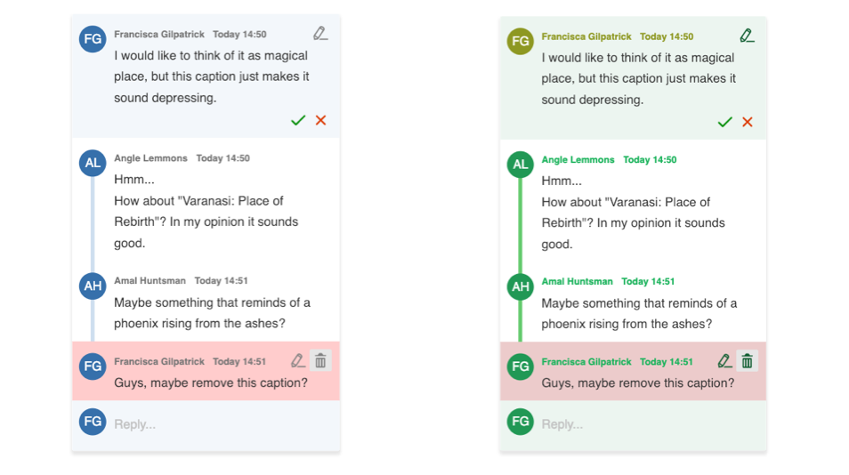
Custom annotation theme
You can change the look of annotations by overriding the default design with CSS variables. This is the lightest-touch way to customize their appearance, without providing a custom template or view.
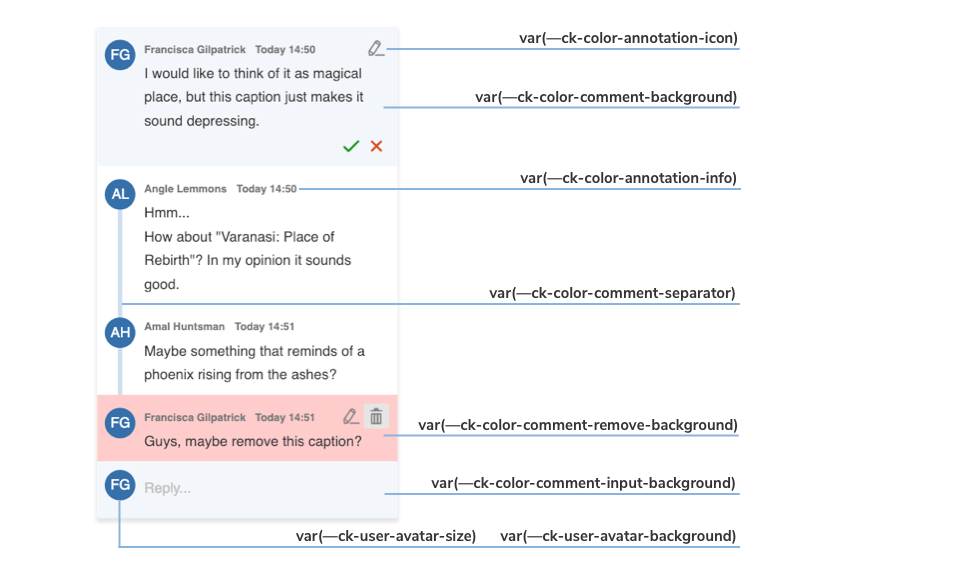
The image above shows you which variables are responsible for every component of the default annotation view.
With the inheritance of CSS variables, you can change the default :root values of the variables in the .ck-sidebar scope. You can override these properties with a .css file or place your customizations directly into the <head> section of your page, but in this case, you will need to use a more specific CSS selector than :root (for example, <body>).
If the editor is mounted inside a shadow root, override the variables on the shadow :host element instead, as described in the Shadow DOM guide.
Check out the color token files for the full list of customizable colors. You can also browse other files with CSS Variables in CKEditor 5.
/* Change the default comment marker color in the content to green. */
:root {
	--ck-comment-marker-color: hsl(127, 98%, 83%);
	--ck-comment-marker-active-color: hsl(127, 98%, 68%);
}

.ck-sidebar {
	/* Thread card: background, border and rounded corners. */
	--ck-annotation-wrapper-background-color: #f4faf6;
	--ck-comment-thread-comments-background-color: transparent;
	--ck-border-surface: 1px solid #b9e2c6;
	--ck-annotation-wrapper-border-radius: 16px;
	--ck-thread-border-radius: 16px;
	--ck-thread-comments-border-radius: 16px;
	--ck-thread-input-border-radius: 12px;

	/* The line connecting comments in a thread. */
	--ck-comment-separator-color: #64ca6d;
	--ck-comment-thread-line-size: 2px;
	--ck-comment-remove-background-color: #eccbcb;

	/* Comment content. */
	--ck-comment-content-font-family: Arial, sans-serif;
	--ck-comment-content-font-size: 13px;
	--ck-comment-content-font-color: #1f3a2b;

	/* Author name, date and action icons. */
	--ck-annotation-info-name-color: #0f5c2f;
	--ck-annotation-info-time-color: #1eb35c;
	--ck-annotation-icon-color: #0f5c2f;
	--ck-comment-count-color: #0f5c2f;

	/* Avatars. */
	--ck-user-avatar-background-color: #239855;
	--ck-user-me-avatar-background-color: #0f5c2f;
}

/* The avatar size is set on the annotation itself, so override it there. */
.ck-sidebar .ck-annotation {
	--ck-user-avatar-size: 28px;
}

/* You can even change the appearance of a single element. */
.ck-sidebar .ck-comment__wrapper:first-of-type {
	--ck-annotation-info-name-color: #8e9822;
	--ck-annotation-info-time-color: #8e9822;
	--ck-user-avatar-background-color: #8e9822;
}The examples above will generate the following designs for comments: