Tables in CKEditor 5 (overview)
The table feature provides tools for creating and editing tables. Tables are great for organizing data in a clear, visually appealing way or creating structured content. They are also great for making document layouts for applications such as newsletters or email editors. There are two basic types of tables available: content tables, described in this feature guide, and layout tables used to organize the content rather than present tabular data. You can easily switch between these two types.
Use the insert table button  to insert a new table into the content. Click inside the table to open a contextual toolbar. The toolbar lets you add or remove columns
  and rows
  . You can also merge or split cells
  .
.
Try toggling the caption on and off  . You can also change the properties of the entire table
  or individual cells
  . To control the width of a column, click and drag its edge.
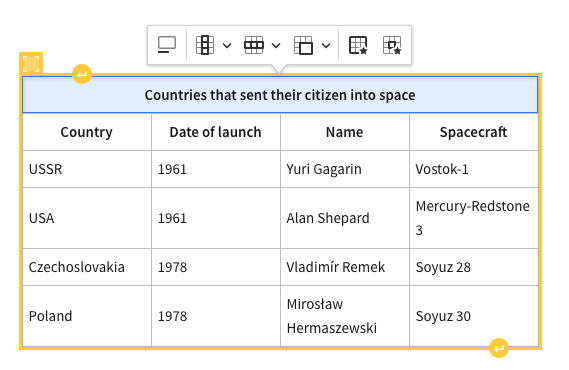
The timeline of human spaceflight
The table below lists the first countries to send a human into space.
|
Country |
Date of launch |
Name |
Spacecraft |
| USSR | 1961 | Yuri Gagarin | Vostok-1 |
| USA | 1961 | Alan Shepard | Mercury-Redstone 3 |
| Czechoslovakia | 1978 | Vladimír Remek | Soyuz 28 |
| Poland | 1978 | Mirosław Hermaszewski | Soyuz 30 |
| East Germany | 1978 | Sigmund Jähn | Soyuz 31 |
You may look for more interesting details in the Tables in CKEditor 5 blog post after reading this guide.
The basic table features allow users to insert tables into content, add or remove columns and rows and merge or split cells.
The @ckeditor/ckeditor5-table package contains multiple plugins that implement various table-related features. The Table plugin is at the core of the ecosystem and it provides the table functionality. There are many other features that extend the editor capabilities:
The TableSelection plugin introduces support for the custom selection system for tables that lets you:
- Select an arbitrary rectangular table fragment – a few cells from different rows, a column (or a few of them) or a row (or multiple rows).
- Apply formatting or add a link to all selected cells at once.
The table selection plugin is loaded automatically by the Table plugin and can be tested in the demo above.
You can move tables horizontally to create a desired document layout. There are five alignment options in tables:
- Left (block)
 : A table aligns to the left. The table does not influence the flow of other content.
 - Center
 : A table is horizontally centered, with equal amounts of space on both sides.
 - Right (block)
 : A table is aligned to the right. The table does not influence the flow of other content.
 - Left (wrap)
 : A table aligns to the left, and other content wraps around it.
 - Right (wrap)
 : A table aligns to the right, and other content wraps around it.
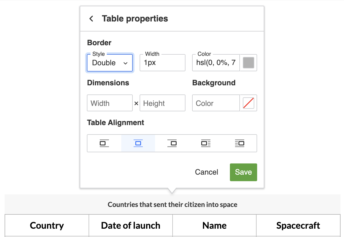
You can find all of those options in the table properties balloon. The balloon displays after you click on a table. Use the demo above to test all those options.
You can also control how the alignment appears in the editor’s output. Learn more about it in the Table alignment in output section.
Two types of table cells can contain content: data cells (the default type) and header cells. Header cells provide semantic labelling for rows or columns, helping the browser or a screen reader understand the data arrangement and relations.
To change cell type, click the cell and use the cell properties icon from the table toolbar. Once there, choose the desired cell type.
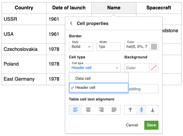
To create a header row or column in your table, select all cells in the row or column and change their type to header. You will see the type change automatically in the row/column property dialog.
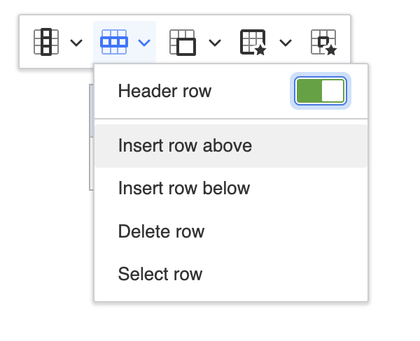
It is easier to use the row/column property dialog to change these into headers, rather than use the cell property method.
Header cells can use the scope attribute to explicitly associate themselves with the related row or column, which helps screen readers understand the table structure.
This attribute is available only for header cells and is enabled by default. The editor assigns the scope attribute automatically based on a header cell’s position. If you prefer, you can change it manually in the cell properties balloon. The dropdown offers two explicit options:
- Column header – forces a header cell to describe the column and sets
scope="col". - Row header – forces a header cell to describe the row and sets
scope="row".
To disable this behavior, set the config.table.tableCellProperties.scopedHeaders configuration option to false.
To type before or after a table easily, select the table, then press the Arrow key (← or →) once, depending on where you want to add content – before or after. The table is no longer selected and whatever text you type will appear in the desired position.
CKEditor 5 allows nesting tables inside other table’s cells. This may be used for creating advanced charts or layouts based on tables. The nested table can be formatted just like a regular one.
You can test this feature in the demo below by adding a new table in the blank “abandoned” section at the bottom of the existing table. Click inside a cell and use the insert table button . A nested table will appear inside the cell.
American spacecraft
| Status | Name and service time | ||||||||
| discontinued |
|
||||||||
| in use |
|
||||||||
| planned |
|
||||||||
| abandoned |
While table nesting is fully functional, the Markdown code generated with the Markdown output feature will not properly render nested tables (#9475). Feel free to upvote 👍 this issue on GitHub if it is important for you.
The TableToolbar plugin introduces a contextual toolbar for table. The toolbar appears when a table or a cell is selected and contains various table-related buttons. These would typically include add or remove columns and rows and merge or split cells . If these features are configured, the toolbar will also contain buttons for captions and table and cell properties.
The table selection plugin is loaded automatically by the Table plugin and can be tested in the demo above. Learn more about configuring a contextual toolbar in the Common API section.
The table feature allows for creating block content (like paragraphs, lists, headings, etc.) inside table cells. However, if a table cell contains just one paragraph and this paragraph has no special attributes (like text alignment), the cell content is considered “inline” and the paragraph is not rendered.
This means that a table cell can have two states: with inline content or with block content. The reason for this differentiation is that most tables contain only inline content (like the demo above) and it is common for “data tables” to not contain any block content. In such a scenario, printing out <p> elements would be semantically wrong and also unnecessary. There are, however, scenarios where the user wants to create, for example, a list inside a table cell and then the support for block content is necessary.
“Rendering” here refers to the view layer. In the model, a cell is always filled with at least a <paragraph>. This is because of consistency, as – since a cell always has some block content – the text is never directly inside the <tableCell>. This also allows features like Enter support to work out of the box (since a <paragraph> exists in the model, it can be split despite the fact that it is not present in the view).
The following is the model representation of table cells with inline content only (a single <paragraph> inside):
<table>
    <tableRow>
        <tableCell>
            <paragraph>Foo</paragraph>
        </tableCell>
        <tableCell>
            <paragraph>Bar</paragraph>
        </tableCell>
    </tableRow>
</table>
The above model structure will be rendered to the data as:
<figure class="table">
    <table>
        <tbody>
            <tr>
                <td>Foo</td>
                <td>Bar</td>
            </tr>
        </tbody>
    </table>
</figure>
In the editing view (the editable container in which the user edits the content), additional <span> elements are created to compensate for the hidden <paragraph> elements:
<figure class="table">
    <table>
        <tbody>
            <tr>
                <td><span>Foo</span></td>
                <td><span>Bar</span></td>
            </tr>
        </tbody>
    </table>
</figure>
If a table cell contains any other block content than a single <paragraph> with no attributes, these block elements will be rendered.
The following is a sample table with some block content (model representation):
<table>
    <tableRow>
        <tableCell>
            <paragraph>Foo</paragraph>
            <paragraph>Bar</paragraph>
        </tableCell>
        <tableCell>
            <heading1>Some title</heading1>
        </tableCell>
        <tableCell>
            <paragraph textAlign="right">Baz</paragraph>
        </tableCell>
    </tableRow>
</table>
The above model structure will be rendered to the data and to the editing view as:
<figure class="table">
    <table>
        <tbody>
            <tr>
                <td>
                    <p>Foo</p>
                    <p>Bar</p>
                </td>
                <td>
                    <h2>Some title</h2>
                </td>
                <td>
                    <p style="text-align: right;">Baz</p>
                </td>
            </tr>
        </tbody>
    </table>
</figure>
At the moment, it is not possible to completely disallow block content in tables. See the discussion on GitHub about adding a configuration option that would enable that. Feel free to upvote 👍 if this feature is important to you.
The source code of the feature is available on GitHub at https://github.com/ckeditor/ckeditor5/tree/master/packages/ckeditor5-table.