Editor styles
CKEditor 5 ships with a predefined theme for its user interface – the toolbar, buttons, panels, dropdowns, and dialogs. You can adjust its colors, typography, spacing, borders, and other visual aspects to match your product by overriding CSS variables (custom properties) in your application. This is separate from content styles, which control the look of the content inside the editor.
The UI theme is organized into three token layers. Override the layer that matches how far your change should reach:
- Foundation – primitives that cause a global shift, such as the palette, the scale, and the shape unit.
- Semantic – design roles shared across components.
- Component – individual editor parts.
The example below groups the variables by layer:
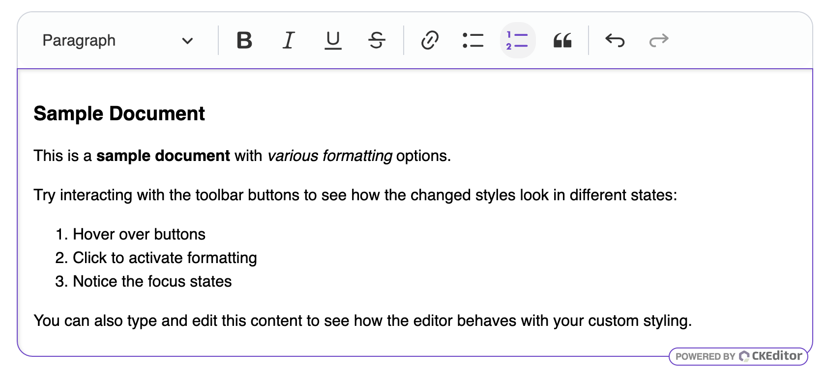
:root {
	/* Foundation: primitives that cause a global shift (palette, scale, shape unit). */
	--ck-color-base-background: hsl(210, 33%, 99%);
	--ck-color-base-selected: hsl(210, 8%, 95%);
	--ck-color-base-active: hsl(263, 59%, 52%);
	--ck-color-base-focus: hsl(263, 59%, 52%);
	--ck-color-base-active-focus: hsl(263, 59%, 42%);
	--ck-focus-border-color: hsl(263, 59%, 52%);
	--ck-radius-base: 16px;
	--ck-font-size-base: 18px;
	--ck-spacing-base: 20px;

	/* Semantic: design roles shared across components. */
	--ck-border-radius-surface: 16px;

	/* Component: individual editor parts. */
	--ck-editor-frame-border-color: hsl(263, 59%, 52%);
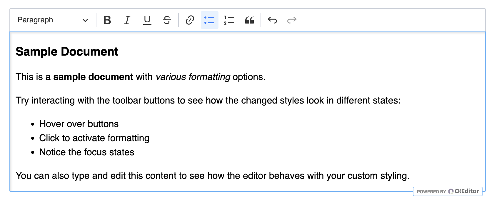
}The default editor’s look:
The editor’s look after customization:
A few essential variables to get started:
| Variable | Layer | Description |
|---|---|---|
--ck-color-base-background |
Foundation | Background of the toolbar and other UI surfaces. |
--ck-color-base-active |
Foundation | Accent for active and selected buttons. |
--ck-focus-border-color |
Foundation | Border color of focused elements, such as the editing area. |
--ck-radius-base |
Foundation | Base unit for rounded corners across the UI. |
--ck-spacing-base |
Foundation | Base spacing unit for the UI. |
--ck-font-size-base |
Foundation | Base font size of the editor UI. |
--ck-border-radius-surface |
Semantic | Corner radius of panels and dropdowns. |
--ck-editor-frame-border-color |
Component | Border color of the editor frame. |
For the full layer model, the complete list of variables, scoped (per-element) overrides, and best practices, see the Theme customization and Theme token naming deep-dive guides. You can also build a complete custom theme – see the dark theme example.
To apply classes or styles directly to the editable area from the editor configuration, see the Applying classes and styles section of the Root types guide. For the CSS that inline roots need, see the Styling inline roots section.
Style sheets are scoped to the DOM tree they belong to. An editor inside a shadow root needs the editor style sheets loaded into that root rather than into the main document. Overriding a CSS variable differs as well: the override has to target the shadow host, because the editor declares its variables on :host there.
The Shadow DOM guide covers both, together with where the floating user interface mounts.